


Building the SNAPIN brand universe
2023
- NOW
BUILDING A BRAND CULTURE:SNAPIN
SNAPIN is an Indian flavour brand making spices, herbs, and seasonings since 2009. It’s not everyday that a company tries to break into India’s spice market which is heavily crowded and regionally divided by legacy spice companies. From a branding point of view - this was a fresh challenge for us. It started with creating the visual identity of one sub-brand. While we waited to finalise that - we ended up with a 3 year working relationship that has now turned into an all encompassing creative collaboration.
What happens when you’re put in charge of a brand with three sub-brands under SNAPIN: Spices, Street, and Select.
These ranges differ in price, type and story. Each range now has their own distinct visual system. Designing for every new touchpoint became a way to build a brand culture rather than just taking the existing rules (palette, type, iconography) and stamping them onto new packaging, new categories, new formats. This became our throughline, which was a consistent point of view that's flexible enough to generate different expressions depending on what the category needs.

the journey
We started with SNAPIN Gourmet, a premium ingredient line already in the market, but in need of a branding overhaul for a more niche audience. It was a months-long exploration of label design and logo work before four products were ready to hit shelves. There was a mutual excitement in how well we worked together through that process, and SNAPIN brought us on in a retainership. This is where we worked within their existing brand system to produce packaging, ads, and print collateral for their parent brand, SNAPIN Spices, as well.
Next, SNAPIN saw an opportunity to differentiate in the spice blends market through Indian street food flavours in a fun, social, and affordable way. We built upon this after upgrading packaging for their hero product, Jaljeera, and it grew into SNAPIN Street for which we’ve created the branding, ads, print, product design, and a kiosk. The kiosk was an end-to-end project that pulled together multiple design disciplines at once, including the structural design, server uniforms, and the customer flow through the space.
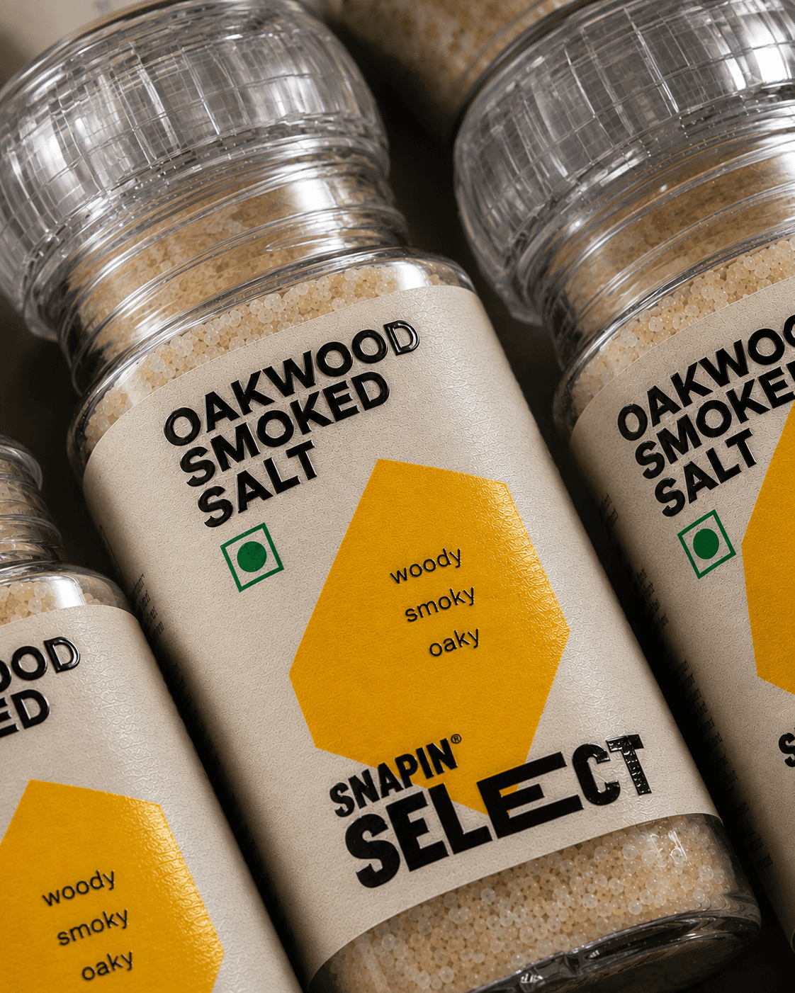
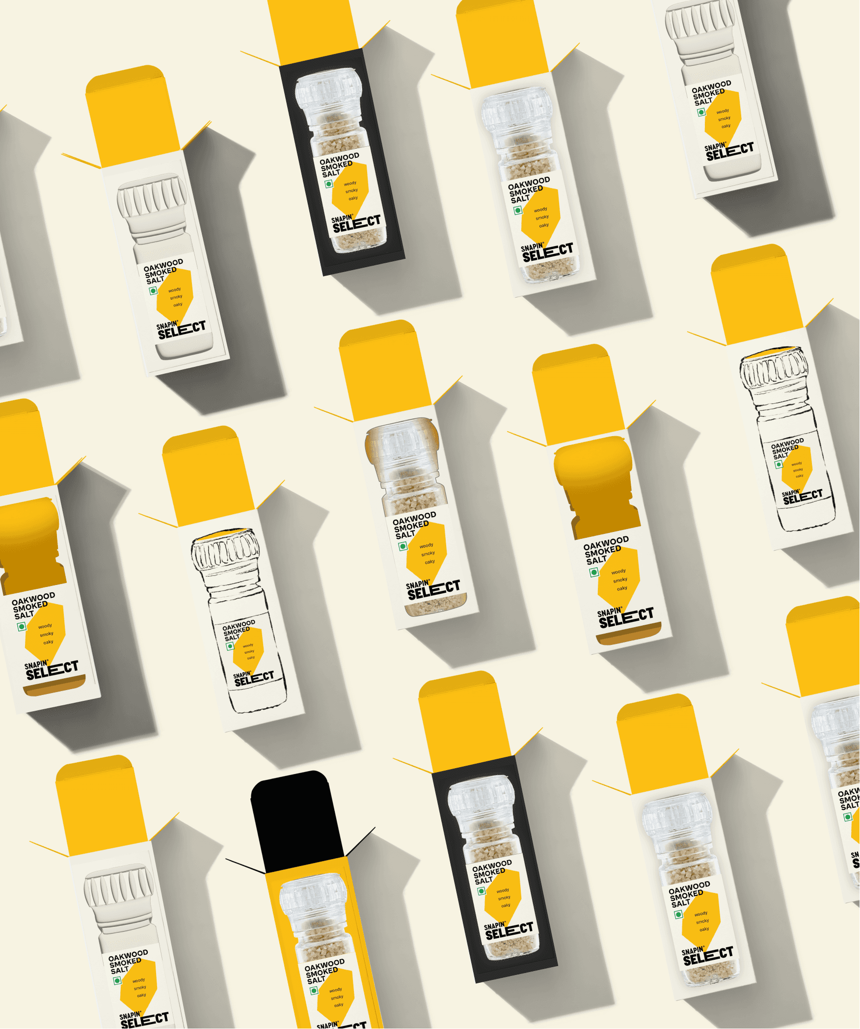
Since then, we've rebranded SNAPIN Gourmet into SNAPIN Select, developed Food Standing Units for each brand vertical, refreshed SNAPIN Spices packaging, and produced over 150 designed outputs for the brand. What started as a single packaging brief has given us the opportunity to build a harmonious universe across every part of SNAPIN's world, and to keep building it as the brand keeps growing.
Across all three verticals, the branding had to stay young and fun, look distinct from its competition, retain its recognisability, and hold up equally well on a phone screen (on quick commerce apps) and on a physical shelf.
Each vertical demanded different design thinking. But all of them depended on the same thing underneath which was understanding the SNAPIN umbrella deeply enough to extend it three different ways without it ever fracturing into three different brands.



outcome
This relationship represents our studio's ability to grow alongside a client as a design partner which started out as executing within someone else's brand system, to being trusted to build new ones, to eventually shaping the entire physical retail spaces these brands now exist in.
In terms of the design variation an challenge it was interesting to have the opportunity to diversify SNAPIN's brand language. The briefs are varied, each one asking for a different depth of brand application, whether it's packaging, ads, or office graphics. Part of this comes from how the collaboration plays out with Rohina Dass, the studio creative director and Koumudi, SNAPIN’s creative director work together almost as peers, with a mutual understanding of what a piece of creative needs to capture.
It works as a positive loop where the frequency ensures prioritisation and quicker turnaround, and for the more strategic projects, there’s time saved where we'd otherwise spend re-learning a brand. This loop makes the design both more creative and more functional. Adaptability to make quick changes, keep evolving with the market and shifting tastes, and still hold onto consistency and brand recall throughout has been our greatest strength.
It's also given us more freedom to explore new directions since we built these systems ourselves, we understand their restrictions/limitations as well as we understand their possibilities, and that's what lets us keep pushing SNAPIN to stand out in the market. And because of all this, eeach otuchpoints still looks well curated, and still complements the rest.
If you’ve come so far, lets connect.
Designing Medical Packaging for B2C and B2B
02


LETS GET
STARTED
LETS GET
STARTED
2023 - NOW
2023 - NOW
Building the SNAPIN brand universe
BUILDING A BRAND CULTURE:SNAPIN
SNAPIN is an Indian flavour brand making spices, herbs, and seasonings since 2009. It’s not everyday that a company tries to break into India’s spice market which is heavily crowded and regionally divided by legacy spice companies. From a branding point of view - this was a fresh challenge for us. It started with creating the visual identity of one sub-brand. While we waited to finalise that - we ended up with a 3 year working relationship that has now turned into an all encompassing creative collaboration.
What happens when you’re put in charge of a brand with three sub-brands under SNAPIN: Spices, Street, and Select.
These ranges differ in price, type and story. Each range now has their own distinct visual system. Designing for every new touchpoint became a way to build a brand culture rather than just taking the existing rules (palette, type, iconography) and stamping them onto new packaging, new categories, new formats. This became our throughline, which was a consistent point of view that's flexible enough to generate different expressions depending on what the category needs.
the journey
We started with SNAPIN Gourmet, a premium ingredient line already in the market, but in need of a branding overhaul for a more niche audience. It was a months-long exploration of label design and logo work before four products were ready to hit shelves. There was a mutual excitement in how well we worked together through that process, and SNAPIN brought us on in a retainership. This is where we worked within their existing brand system to produce packaging, ads, and print collateral for their parent brand, SNAPIN Spices, as well.
Next, SNAPIN saw an opportunity to differentiate in the spice blends market through Indian street food flavours in a fun, social, and affordable way. We built upon this after upgrading packaging for their hero product, Jaljeera, and it grew into SNAPIN Street for which we’ve created the branding, ads, print, product design, and a kiosk. The kiosk was an end-to-end project that pulled together multiple design disciplines at once, including the structural design, server uniforms, and the customer flow through the space.
Since then, we've rebranded SNAPIN Gourmet into SNAPIN Select, developed Food Standing Units for each brand vertical, refreshed SNAPIN Spices packaging, and produced over 150 designed outputs for the brand. What started as a single packaging brief has given us the opportunity to build a harmonious universe across every part of SNAPIN's world, and to keep building it as the brand keeps growing.
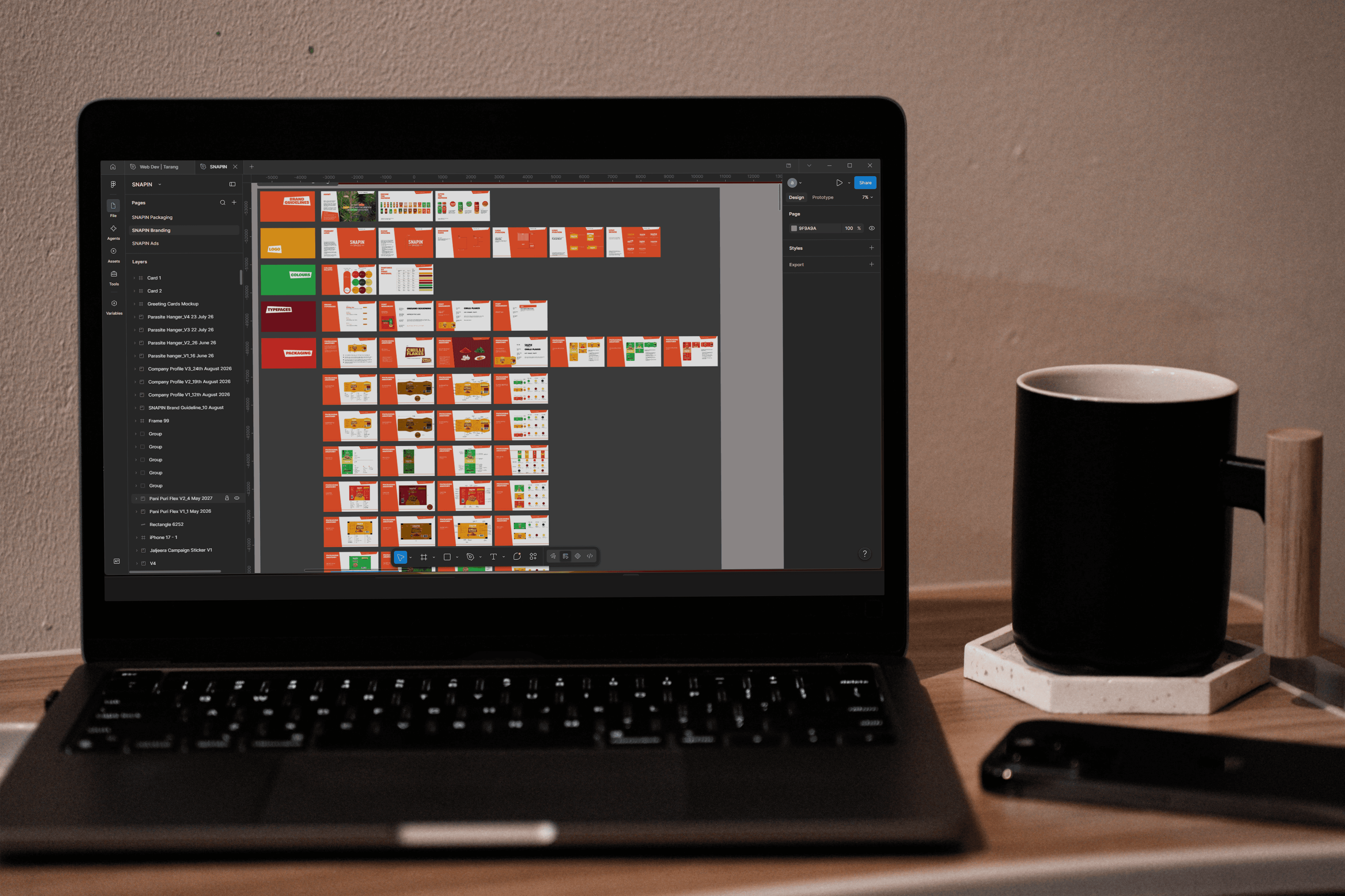
Across all three verticals, the branding had to stay young and fun, look distinct from its competition, retain its recognisability, and hold up equally well on a phone screen (on quick commerce apps) and on a physical shelf.
Each vertical demanded different design thinking. But all of them depended on the same thing underneath which was understanding the SNAPIN umbrella deeply enough to extend it three different ways without it ever fracturing into three different brands.


outcome
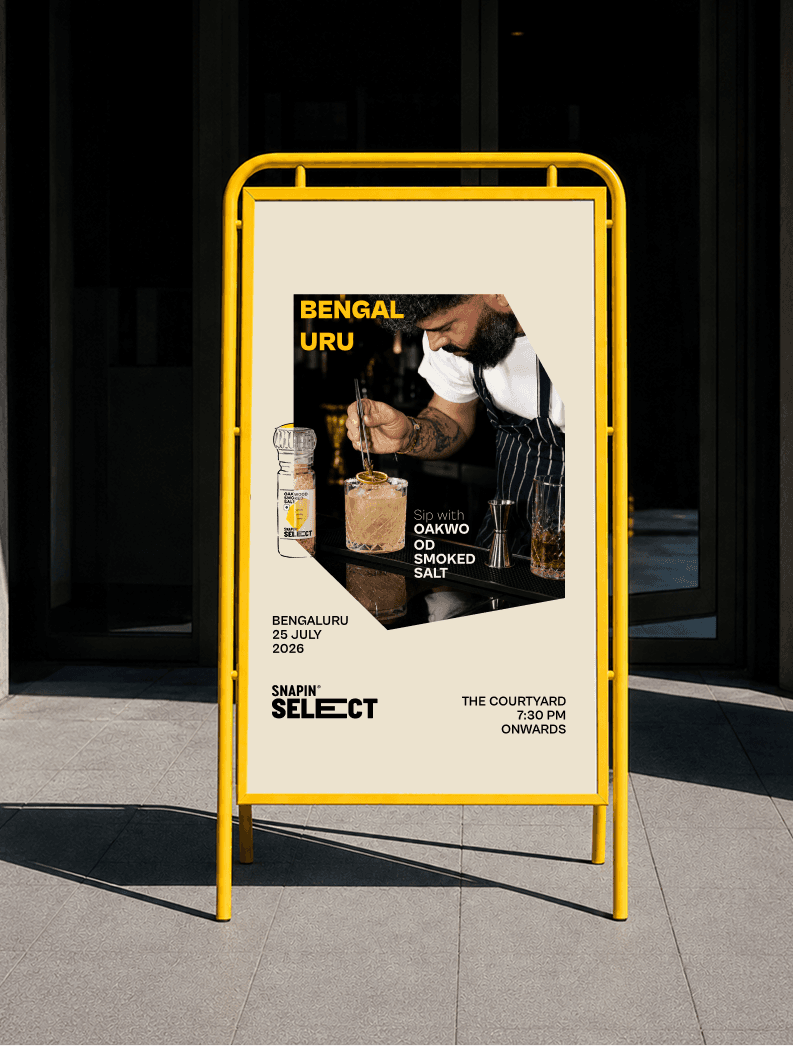
This relationship represents our studio's ability to grow alongside a client as a design partner which started out as executing within someone else's brand system, to being trusted to build new ones, to eventually shaping the entire physical retail spaces these brands now exist in.
In terms of the design variation an challenge it was interesting to have the opportunity to diversify SNAPIN's brand language. The briefs are varied, each one asking for a different depth of brand application, whether it's packaging, ads, or office graphics. Part of this comes from how the collaboration plays out with Rohina Dass, the studio creative director and Koumudi, SNAPIN’s creative director work together almost as peers, with a mutual understanding of what a piece of creative needs to capture.
It works as a positive loop where the frequency ensures prioritisation and quicker turnaround, and for the more strategic projects, there’s time saved where we'd otherwise spend re-learning a brand. This loop makes the design both more creative and more functional. Adaptability to make quick changes, keep evolving with the market and shifting tastes, and still hold onto consistency and brand recall throughout has been our greatest strength.
It's also given us more freedom to explore new directions since we built these systems ourselves, we understand their restrictions/limitations as well as we understand their possibilities, and that's what lets us keep pushing SNAPIN to stand out in the market. And because of all this, eeach otuchpoints still looks well curated, and still complements the rest.
Designing Medical Packaging for B2C and B2B
02

LETS GET STARTED
