


two audiences, one brand
2025
Designing 360 IDNETITY:THE WHITE ORCHID
The White Orchid came to us with a clear ambition: become the premium early childhood brand in Singapore. Daycare, enrichment, family services, all under one roof. The founders already had a foothold in education. This was their next chapter, and they wanted it to enter a premium category.
We were brought in to brand the entire user journey - every touchpoint, built to earn trust in an environment where the value of holistic child support is just being understood.
tension in the brief
There’s a design problem when developing branding for a service or product for children: your end user is a child that likes things warm and joyful but the parents need to see differentiation and quality.
Premium and joyful are natural visual opposites at first. Premium says: clean lines, muted tones, serious typography. Joyful says: colour, warmth, hand-drawn chaos. Add to that a dual audience, parents making high-stakes decisions based on trust and safety, and children who just want to feel something, and you've got a brief that can't be solved with a template.
Oh, and one more thing: don't make it look like a hotel, lest we be seen as a knockoff of the White Lotus.
we zoomed out before we zoomed in
We started where we always do, going through a custom questionnaire with founders. They had sent us a brand brief prior based on which we drafted those questions. Of course we had already started envisioning what their expectations were but the conversation flipped our view completely - focusing a lot on the premium aspect. At the end of the conversation, four core associations surfaced: Trustworthy. Personable. Joyful. Inspired.
We mapped the competitive landscape across Singapore's daycare space, websites, social feeds, and the whole visual diet a parent consumes before making a decision. Then we went further, studying brands outside the category entirely to see how these 4 words became something people associated with them.
That's the zoom-out. The zoom-in came next.


three distinct directions
Across all three verticals, the branding had to stay young and fun, look distinct from its competition, retain its recognisability, and hold up equally well on a phone screen (on quick commerce apps) and on a physical shelf.
Each vertical demanded different design thinking. But all of them depended on the same thing underneath which was understanding the SNAPIN umbrella deeply enough to extend it three different ways without it ever fracturing into three different brands.


A Brand Guideline That Grew on Site
Once the visual direction was locked, we iterated on logo forms. We looked at a variety of ways to represent the beautiful 5 petalled flower.
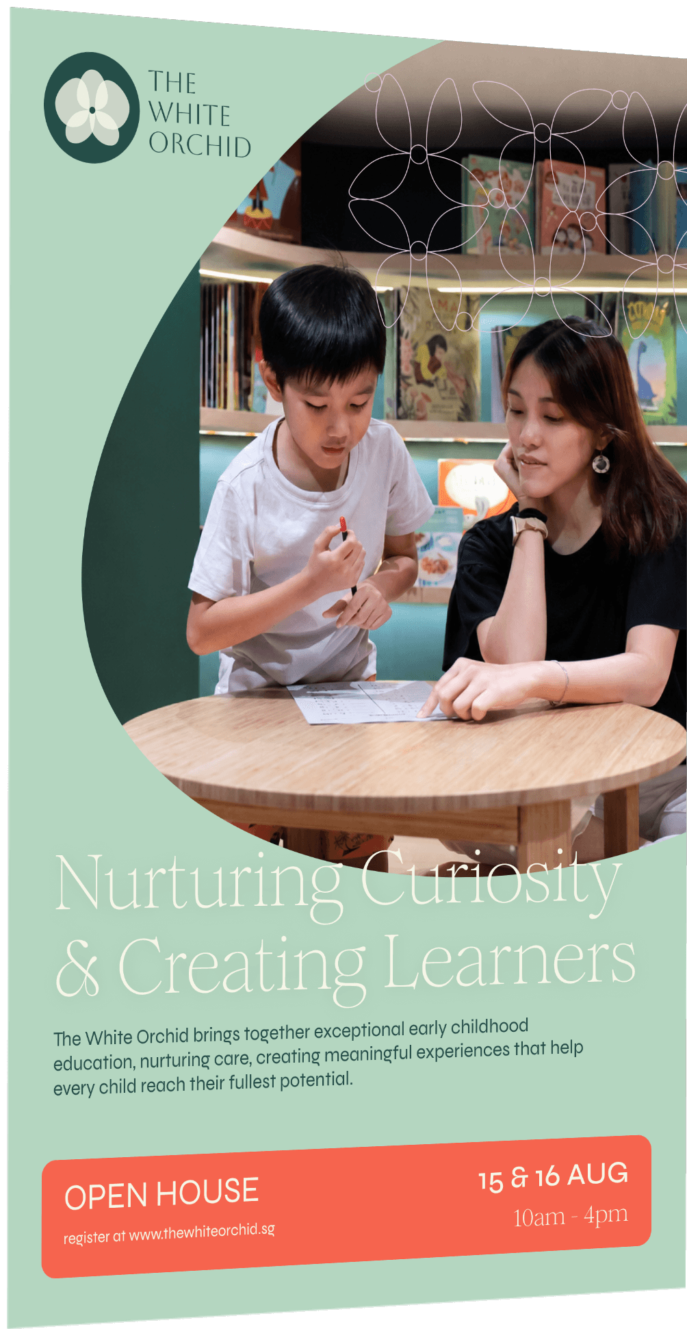
The work then expanded in an unexpected direction. A separate session with the school's interior designers and architects revealed an opportunity we hadn't anticipated, aligning the brand's visual language with the physical space itself. That conversation gave birth to something we hadn't formally included in a guideline before: a texture palette. The brand now was moving from screens into an actual space!
The Website Came After the Brand Was Lived In
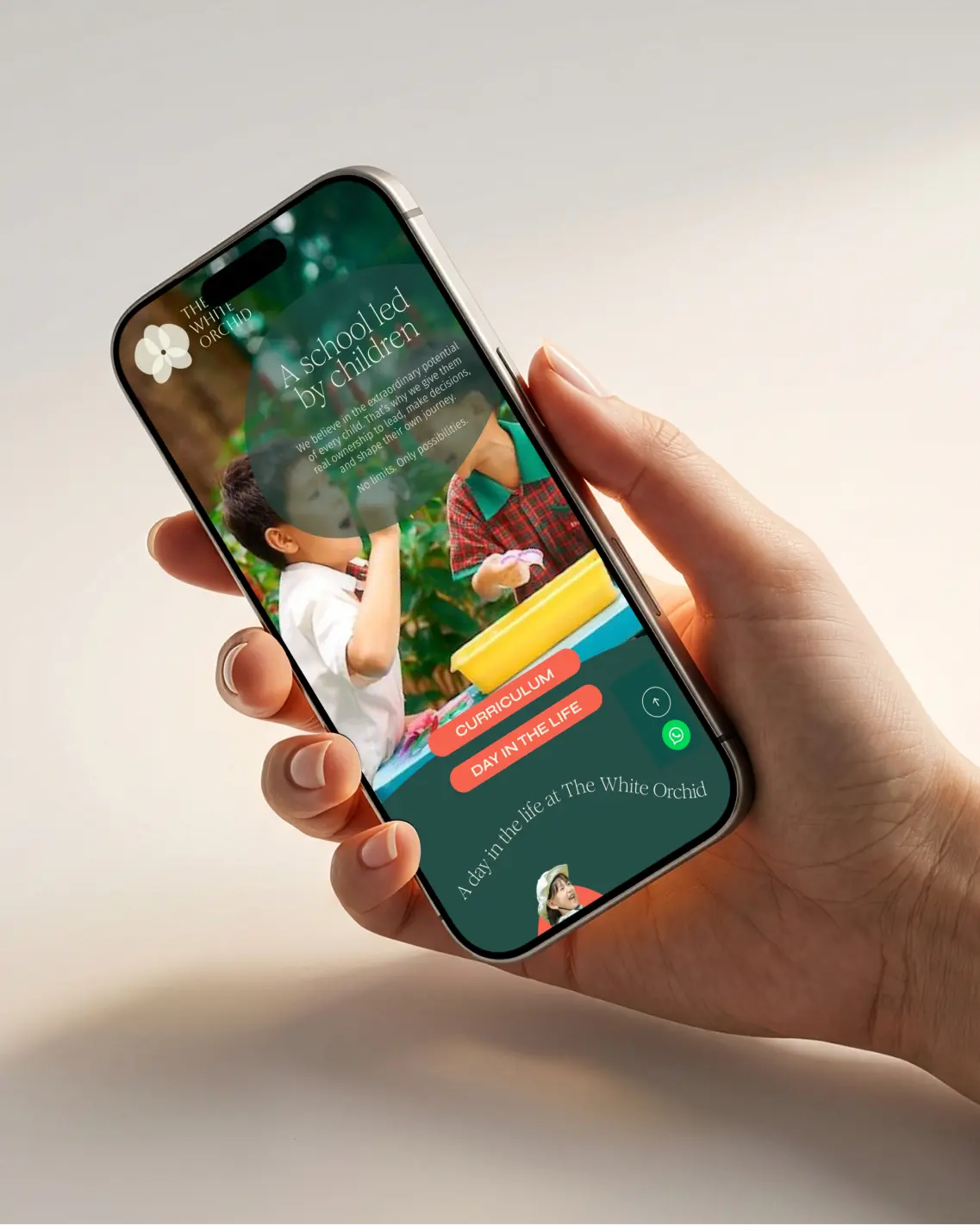
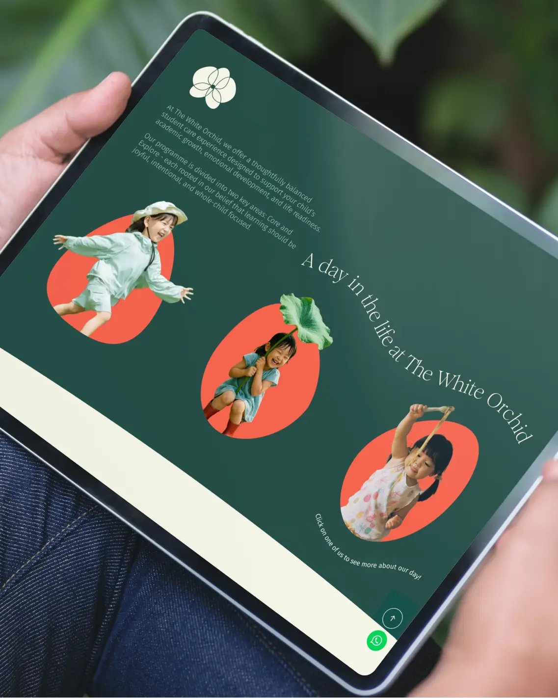
A few months post-launch, the founders came back to develop a website. By then, the brand had been tested in the real world, which made designing the digital experience sharper.
We ran a full user journey study, built the sitemap, and moved into UI/UX design for both desktop and mobile. The brief called for immersive and modern, but still approachable. And a custom Experience page that needed to do more than inform - it needed to make you remember how fun school could be (especially one with a slide in the middle of it!)
what we learned
We went all out on the process for this one - creating not just a visual but a verbal brand too! Our clients trusted us, enjoyed being part of the process, made quick and thought out decisions to keep the project on track and had fun with it! We learned how to create a world out of the brand that was being implemented in the real world swiftly.


If you’ve come so far, lets connect.
BUILDING A BRAND CULTURE:SNAPIN
01


LETS GET
STARTED
LETS GET
STARTED
2025
two audiences, one brand
BUILDING A BRAND CULTURE:SNAPIN
The White Orchid came to us with a clear ambition: become the premium early childhood brand in Singapore. Daycare, enrichment, family services, all under one roof. The founders already had a foothold in education. This was their next chapter, and they wanted it to enter a premium category.
We were brought in to brand the entire user journey - every touchpoint, built to earn trust in an environment where the value of holistic child support is just being understood.
tension in the brief
There’s a design problem when developing branding for a service or product for children: your end user is a child that likes things warm and joyful but the parents need to see differentiation and quality.
Premium and joyful are natural visual opposites at first. Premium says: clean lines, muted tones, serious typography. Joyful says: colour, warmth, hand-drawn chaos. Add to that a dual audience, parents making high-stakes decisions based on trust and safety, and children who just want to feel something, and you've got a brief that can't be solved with a template.
Oh, and one more thing: don't make it look like a hotel, lest we be seen as a knockoff of the White Lotus.
we zoomed out before we zoomed in
We started where we always do, going through a custom questionnaire with founders. They had sent us a brand brief prior based on which we drafted those questions. Of course we had already started envisioning what their expectations were but the conversation flipped our view completely - focusing a lot on the premium aspect. At the end of the conversation, four core associations surfaced: Trustworthy. Personable. Joyful. Inspired.
We mapped the competitive landscape across Singapore's daycare space, websites, social feeds, and the whole visual diet a parent consumes before making a decision. Then we went further, studying brands outside the category entirely to see how these 4 words became something people associated with them.
That's the zoom-out. The zoom-in came next.
three distinct directions
Across all three verticals, the branding had to stay young and fun, look distinct from its competition, retain its recognisability, and hold up equally well on a phone screen (on quick commerce apps) and on a physical shelf.
Each vertical demanded different design thinking. But all of them depended on the same thing underneath which was understanding the SNAPIN umbrella deeply enough to extend it three different ways without it ever fracturing into three different brands.
A Brand Guideline That Grew on Site
Once the visual direction was locked, we iterated on logo forms. We looked at a variety of ways to represent the beautiful 5 petalled flower.
The work then expanded in an unexpected direction. A separate session with the school's interior designers and architects revealed an opportunity we hadn't anticipated, aligning the brand's visual language with the physical space itself. That conversation gave birth to something we hadn't formally included in a guideline before: a texture palette. The brand now was moving from screens into an actual space!
The Website Came After the Brand Was Lived In
A few months post-launch, the founders came back to develop a website. By then, the brand had been tested in the real world, which made designing the digital experience sharper.
We ran a full user journey study, built the sitemap, and moved into UI/UX design for both desktop and mobile. The brief called for immersive and modern, but still approachable. And a custom Experience page that needed to do more than inform - it needed to make you remember how fun school could be (especially one with a slide in the middle of it!)
what we learned
We went all out on the process for this one - creating not just a visual but a verbal brand too! Our clients trusted us, enjoyed being part of the process, made quick and thought out decisions to keep the project on track and had fun with it! We learned how to create a world out of the brand that was being implemented in the real world swiftly.
BUILDING A BRAND CULTURE:SNAPIN
01

LETS GET STARTED
