


Lifeline and Aurus
2025
Designing Medical Packaging for B2C and B2B
Medical packaging is bound by regulation, information density, and the scrutiny of audiences who need to trust what they're looking at quickly. In covering two medical packaging briefs for two very different ends of the market, we prioritised information dense content based on the product’s journey.
Medical devices are highly specialised, which means a huge range of SKUs. Whether B2B or B2C, packaging has a different job at every stage of the supply chain - sorting, logistics, storage, showcase, and finally sale and unboxing at home. In the storeroom, it has to be instantly identifiable — the name and type visible at a glance, or the product simply doesn't move. On a showcase shelf, it has to be easy for a customer to understand at first read. And once it's home, the labels, descriptions, and features have to stay clearly understandable, because that's what limits liability.
This is what makes it markedly different from most other products: packaging elsewhere is mostly designed to attract and serves its purpose once bought. Medical packaging has to keep doing its job long after the sale whether as an instruction, as reference, as protection against things going wrong.
context
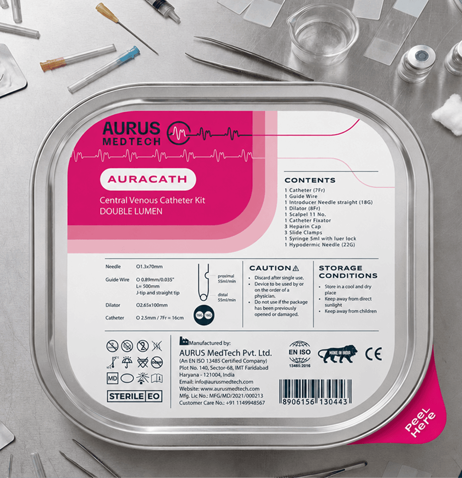
Lifeline is a B2C-facing device manufacturer oriented towards at-home care, pharmacies as well as hospitals and clinics. Aurus is a B2B institutional supplier of tubing-related medical devices, sold directly to hospitals and clinics.
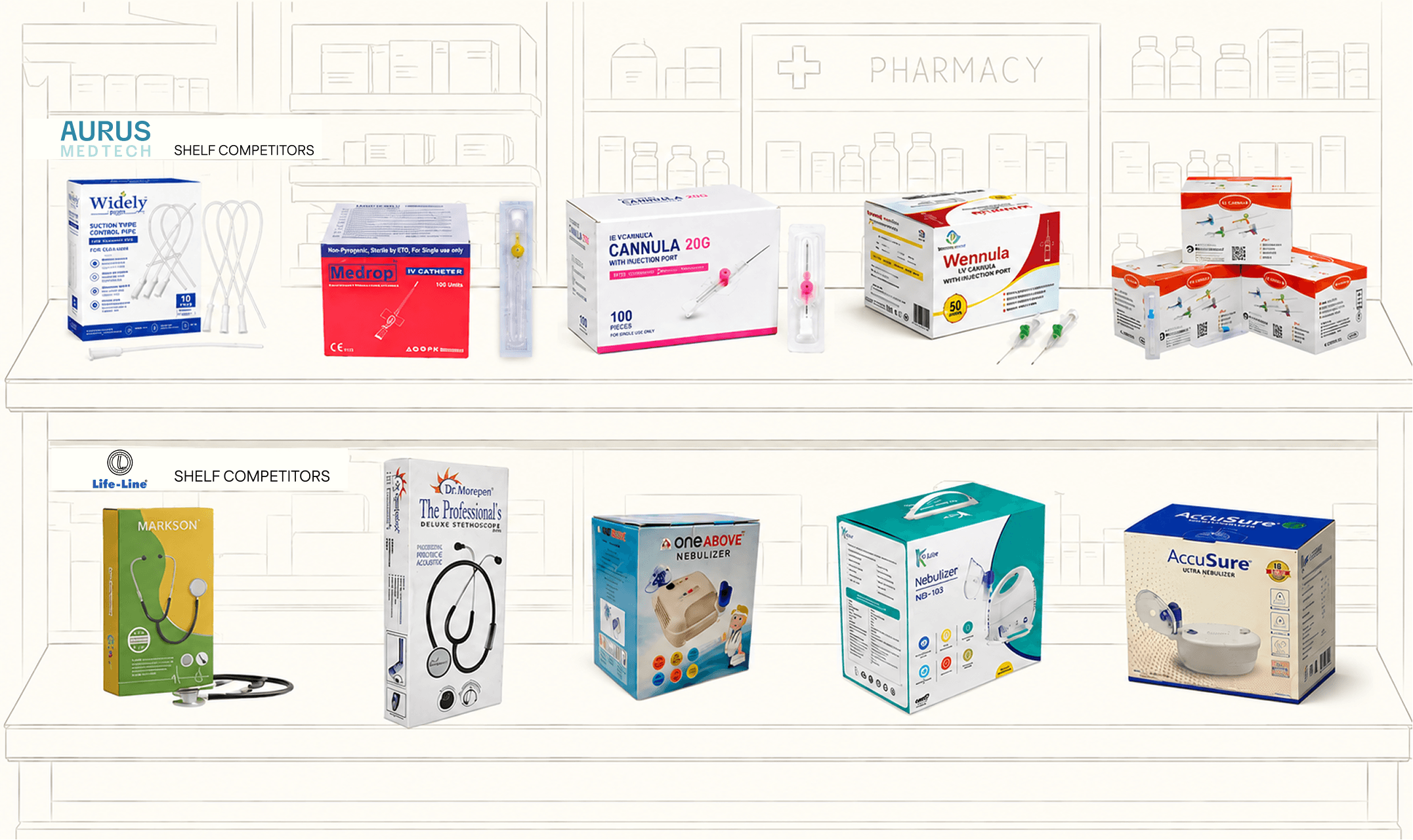
Both briefs shared the same outline, which was to stand out from local competition, look credible next to imported products, and do it with a design language flexible enough to scale across a wide and growing SKU range.
CHALLENGE
The two briefs had us solving for consistency and reinvention at the same time.
For Lifeline (B2C):
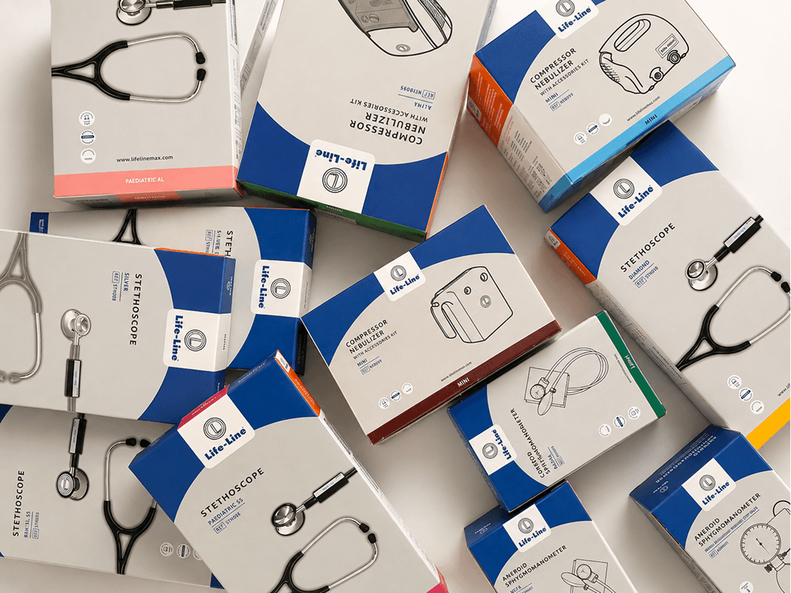
A single visual language needed to work across a wide product range, each item differing in size, specification, and regulatory requirement.
The new stethoscope line needed to feel elevated enough to compete with imported alternatives, while the rest of the catalogue stayed anchored to Lifeline's existing brand colours.
The packaging had to serve two audiences at once: end users comparing specifications and perceived quality, and distributors who needed to identify SKUs instantly, regardless of how the product was shelved or stacked.
For Aurus (B2B):
The brand's logo needed to be reinvented as well as built outward into a pattern, a texture, a system.
The identity needed to be read as distinct and premium in a category where most competitors' packaging is functionally identical: white boxes, black text, logo in the corner.
The modular system was needed - enough to absorb new tubing variants and SKUs as the catalogue grew, without requiring fresh design every time.

APPROACH
The hierarchy of medical specifications, so critical information won the eye first instead of competing with everything else on the pack.
A custom iconography system, translating dense technical USPs into visual cues readable in seconds.
Logo usage and placement, standardised across formats so the brand mark did consistent work everywhere it appeared.
A colour-coding system, so a specific SKU sparked quick identification by a distributor from a shelf.
A modular packaging structure, so new tubing variants and SKUs could be absorbed without new design decisions each time.
A confident colour and material language, built to read as premium and clinical at once which was necessary to compete visually with imported institutional suppliers.
Consistent information architecture, so the pattern language gave the brand personality without ever slowing down a procurement officer looking for technical specs.
OUTCOME
Across both projects, the outcome was creating an experience journey in the life of medical packaging. Our process involved a lot of questions about who's going to encounter it, at what stage, and what they need to know at that moment to trust it. And that’s how the visual system came to life.
For Lifeline, that meant a clinician could isolate the two or three facts that actually mattered instead of wading through a wall of specs, and a distributor could identify a SKU by colour alone. For Aurus, it meant building an identity that stood out in a sea of medical packaging while staying premium and trustworthy.

If you’ve come so far, lets connect.
Designing 360 IDNETITY:THE WHITE ORCHID
03

LETS GET
STARTED
LETS GET
STARTED
2025
Lifeline and Aurus
Designing Medical Packaging for B2C and B2B
Medical packaging is bound by regulation, information density, and the scrutiny of audiences who need to trust what they're looking at quickly. In covering two medical packaging briefs for two very different ends of the market, we prioritised information dense content based on the product’s journey.
Medical devices are highly specialised, which means a huge range of SKUs. Whether B2B or B2C, packaging has a different job at every stage of the supply chain - sorting, logistics, storage, showcase, and finally sale and unboxing at home. In the storeroom, it has to be instantly identifiable — the name and type visible at a glance, or the product simply doesn't move. On a showcase shelf, it has to be easy for a customer to understand at first read. And once it's home, the labels, descriptions, and features have to stay clearly understandable, because that's what limits liability.
This is what makes it markedly different from most other products: packaging elsewhere is mostly designed to attract and serves its purpose once bought. Medical packaging has to keep doing its job long after the sale whether as an instruction, as reference, as protection against things going wrong.
context
Lifeline is a B2C-facing device manufacturer oriented towards at-home care, pharmacies as well as hospitals and clinics. Aurus is a B2B institutional supplier of tubing-related medical devices, sold directly to hospitals and clinics.
Both briefs shared the same outline, which was to stand out from local competition, look credible next to imported products, and do it with a design language flexible enough to scale across a wide and growing SKU range.
CHALLENGE
The two briefs had us solving for consistency and reinvention at the same time.
For Lifeline (B2C):
A single visual language needed to work across a wide product range, each item differing in size, specification, and regulatory requirement.
The new stethoscope line needed to feel elevated enough to compete with imported alternatives, while the rest of the catalogue stayed anchored to Lifeline's existing brand colours.
The packaging had to serve two audiences at once: end users comparing specifications and perceived quality, and distributors who needed to identify SKUs instantly, regardless of how the product was shelved or stacked.
For Aurus (B2B):
The brand's logo needed to be reinvented as well as built outward into a pattern, a texture, a system.
The identity needed to be read as distinct and premium in a category where most competitors' packaging is functionally identical: white boxes, black text, logo in the corner.
The modular system was needed - enough to absorb new tubing variants and SKUs as the catalogue grew, without requiring fresh design every time.
approach
The hierarchy of medical specifications, so critical information won the eye first instead of competing with everything else on the pack.
A custom iconography system, translating dense technical USPs into visual cues readable in seconds.
Logo usage and placement, standardised across formats so the brand mark did consistent work everywhere it appeared.
A colour-coding system, so a specific SKU sparked quick identification by a distributor from a shelf.
A modular packaging structure, so new tubing variants and SKUs could be absorbed without new design decisions each time.
A confident colour and material language, built to read as premium and clinical at once which was necessary to compete visually with imported institutional suppliers.
Consistent information architecture, so the pattern language gave the brand personality without ever slowing down a procurement officer looking for technical specs.
OUTCOME
Across both projects, the outcome was creating an experience journey in the life of medical packaging. Our process involved a lot of questions about who's going to encounter it, at what stage, and what they need to know at that moment to trust it. And that’s how the visual system came to life.
For Lifeline, that meant a clinician could isolate the two or three facts that actually mattered instead of wading through a wall of specs, and a distributor could identify a SKU by colour alone. For Aurus, it meant building an identity that stood out in a sea of medical packaging while staying premium and trustworthy.
Designing 360 IDNETITY:THE WHITE ORCHID
03

LETS GET STARTED
